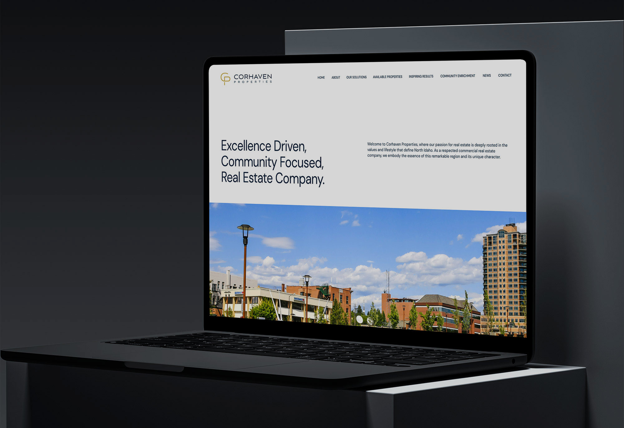
The goal of the rebrand was to enhance visual identity and a renewed commitment to innovation and customer-centricity.
The design approach was minimal, using clean lines and modern typography, reflecting dedication to simplicity and transparency in the real estate buying and selling process. The color palette chosen symbolizes energy, trust, and optimism, aligning with the company mission to guide clients toward their dream properties.
The redesign embodies the evolution and unwavering dedication to providing top-notch real estate solutions while embracing the future with a modern and contemporary approach.

