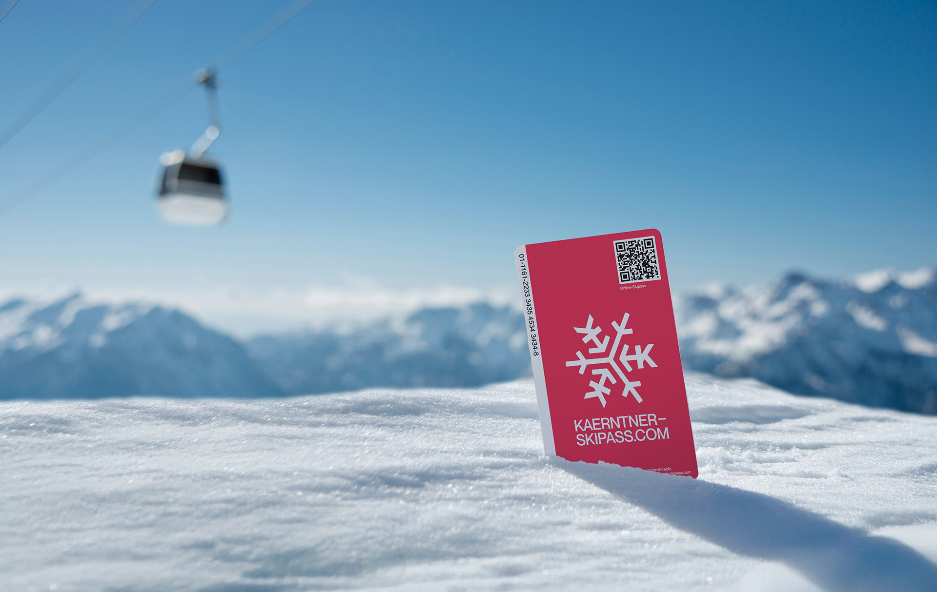
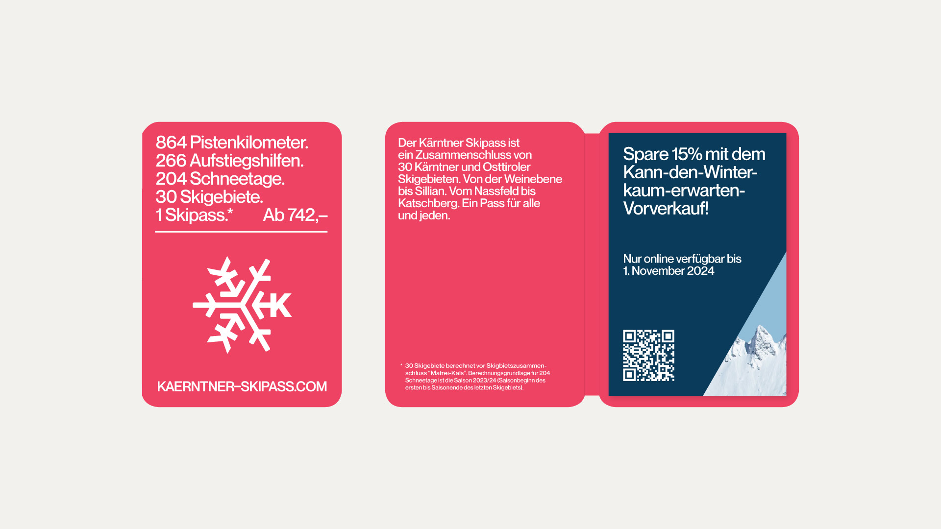
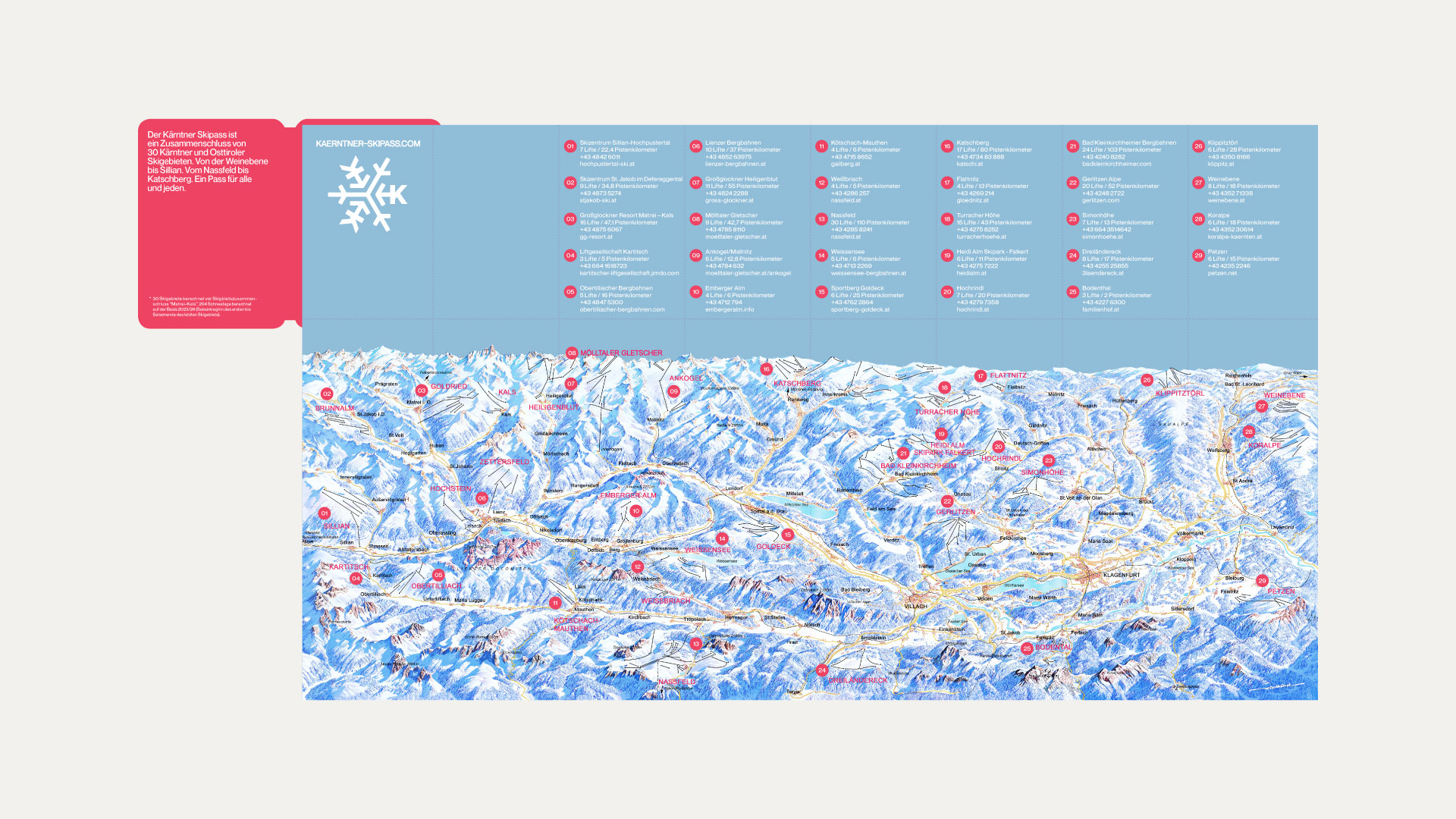
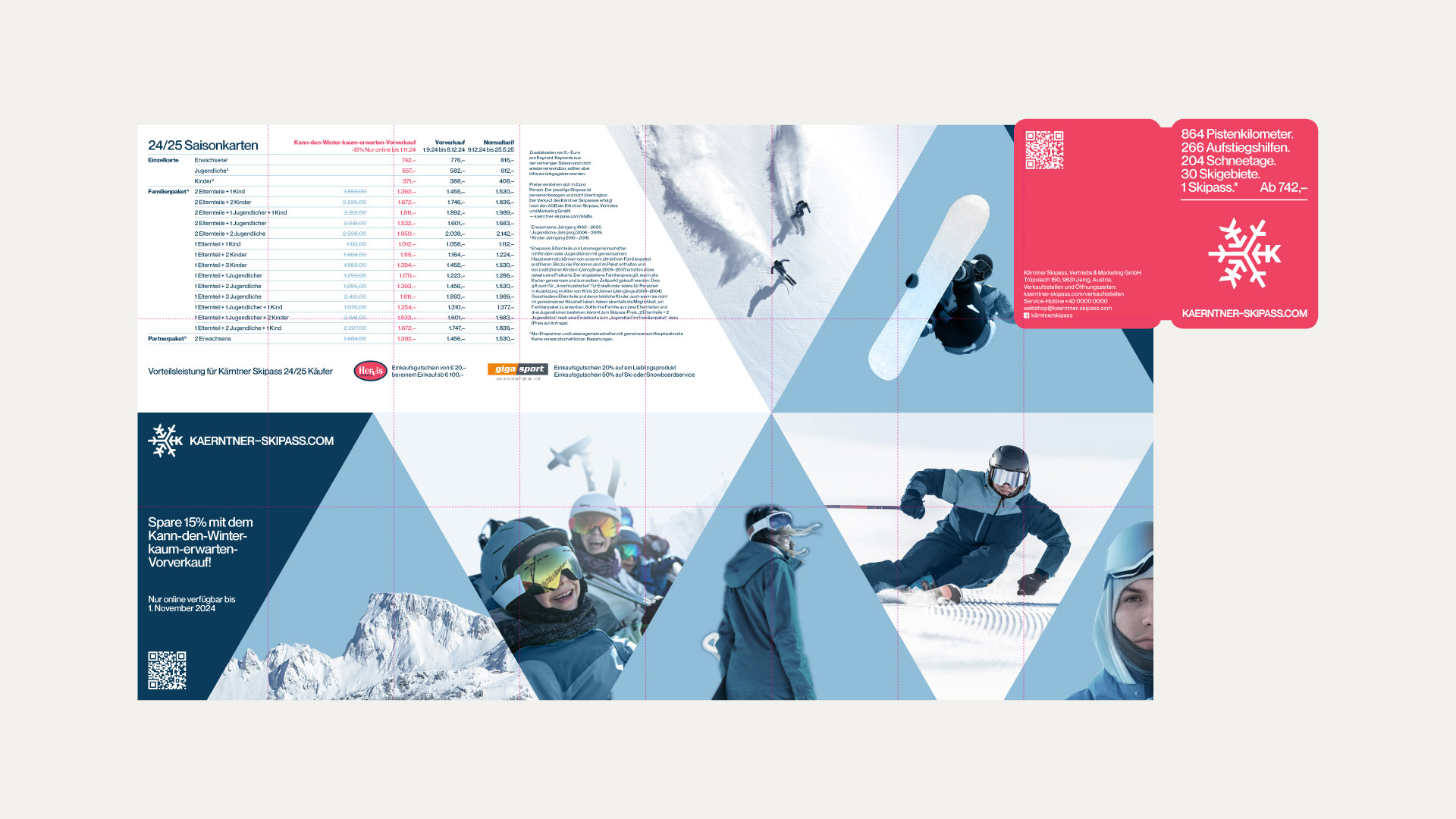
The Kärntner Skipass is a seasonal ski pass that opens the doors to 29 ski resorts across the Carinthian region, from the sunny slopes of Nassfeld to the family-friendly Gerlitzen. The pass embodies the spirit of Carinthian winter: accessible, diverse and deeply rooted in the region’s alpine culture. It appeals to locals, day trippers and winter tourists alike, offering freedom and flexibility on the slopes.
The Challenge
The Kärntner Skipass faced a visibility and perception problem. While the product itself was strong, a single pass for an entire winter wonderland, the brand presence was outdated and inconsistent. A comic-like visual identity no longer resonated with modern winter sports enthusiasts, especially younger generations who expect digital convenience and aesthetic clarity. On top of that the ticket purchasing process was complex and fragmented. Without a centralized webshop many users struggled to navigate the different card types and points of sale.
Strategic Approach
What started as a visual update quickly evolved into a holistic rebrand. The goal was to modernize the Kärntner Skipass without losing its regional soul and to create a seamless user experience across digital and physical touchpoints. A clean minimal design replaced the old visuals, creating a timeless yet fresh look that speaks to all age groups. At the same time strategic UX thinking was applied to the digital interface to make buying a skipass feel as smooth as carving down a groomed slope.
Implementation
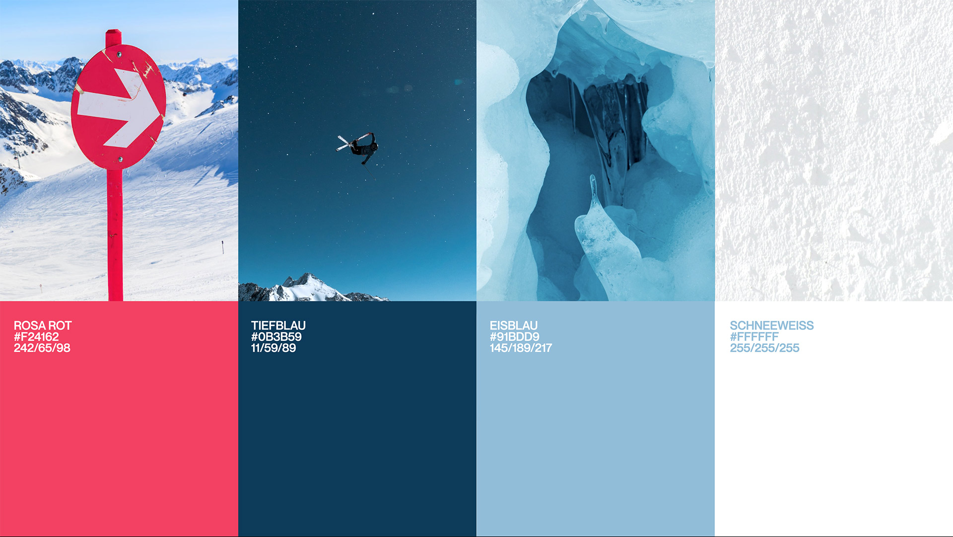
The new design system introduced a restrained color palette and strong typographic clarity, giving the brand a confident contemporary face. Regional flair was subtly embedded, avoiding clichés while honoring the Carinthian identity. A completely new website was designed and developed not only as a source of information but as a powerful digital sales tool. From landing to checkout the shopping experience was reimagined to be intuitive despite the complexity of the product. Multiple card types based on age, family status or usage were addressed through clear call-to-actions, contextual guidance and multiple entry points for purchase. This ensured a frictionless path to conversion.