UX/UI Design
Kollitsch Gruppe
Scroll Down
Background
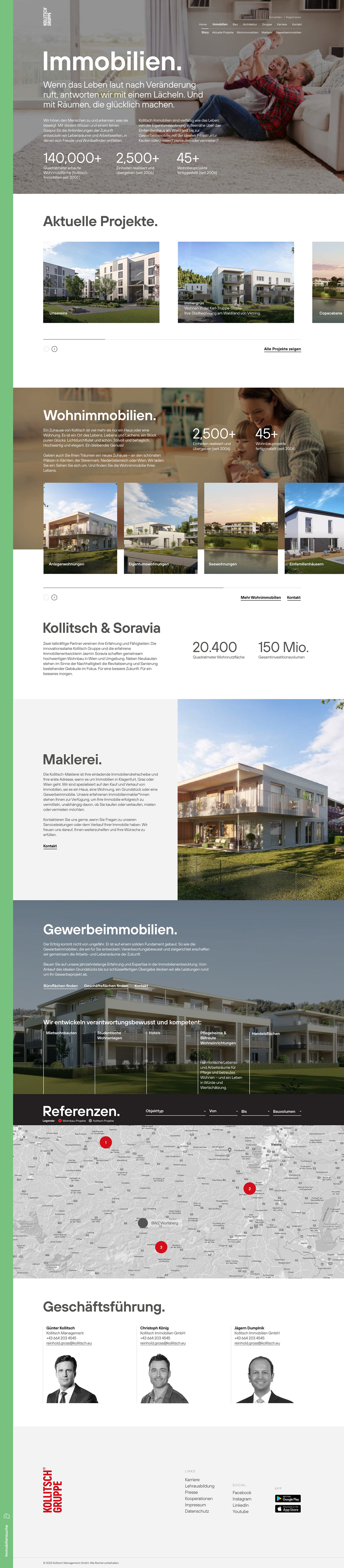
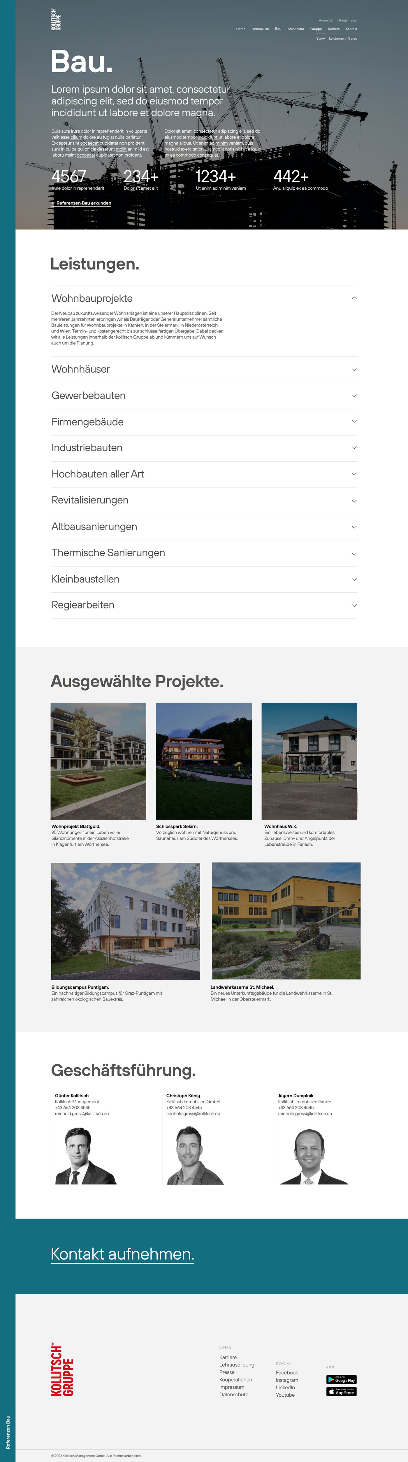
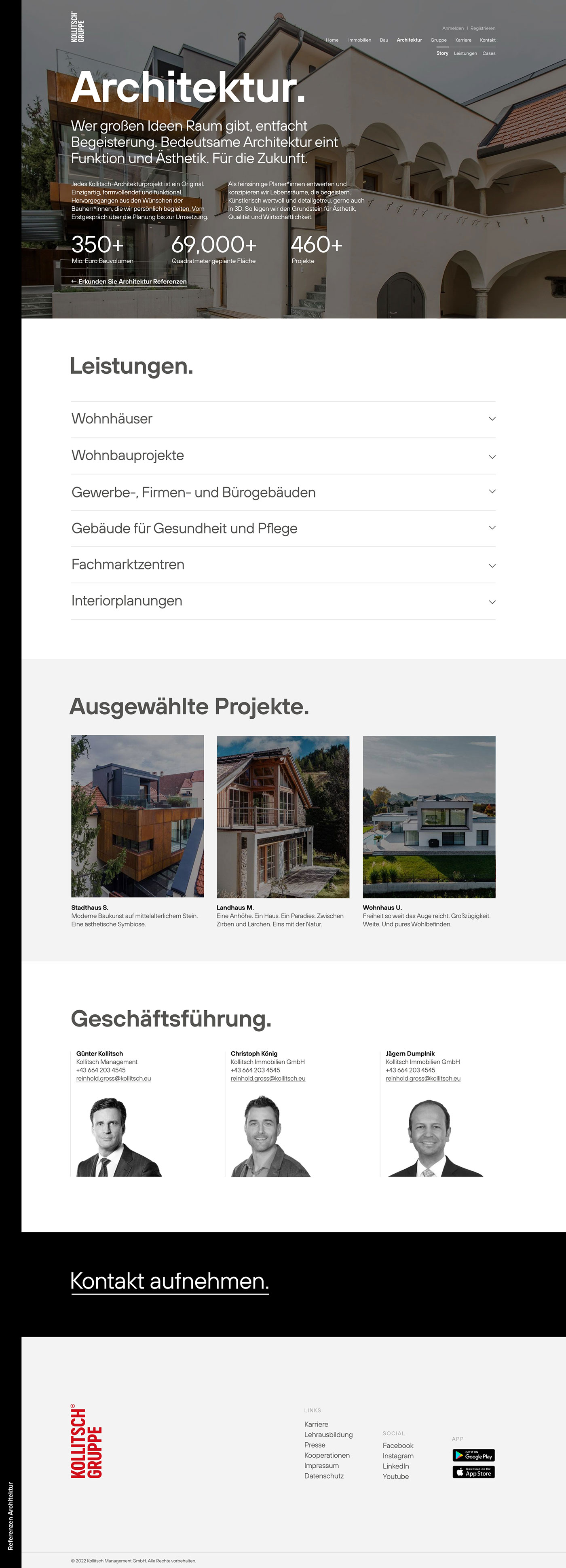
Kollitsch Gruppe is an integrated company based in Klagenfurt, Austria, operating across real estate development, architecture and construction. Known for innovative and large-scale projects, the group has a strong presence in shaping urban and regional environments. Each division operates with a high degree of specialization but under a unified brand.
In the branding process we have assigned Magician archetype to the company representing innovation and transformation. Each division draws from this foundation while expressing additional archetypal traits:
Real Estate: Lover + Magician
Construction: Ambassador + Magician
Architecture: Creator + Magician
Despite their physical impact, their digital presence was outdated. The website lacked structure, emotional resonance and failed to differentiate the company’s core divisions.
Research
– Usability testing (old site)
– User behaviour (old site - Google Analytics)
– Competitor benchmarking (Austrian market)
– Stakeholder interviews
Key findings
– Confusion with division structure
– Difficulty accessing detailed project pages
– High bounce rate on landing page

2. Define
Problem
The previous website had following issues:
– Generic visuals, lacked premium tone
– Poor visual navigation across divisions
– No compelling story for high-end properties
– Unoptimized for modern search behavior
–High bounce rate on the landing page
Goals
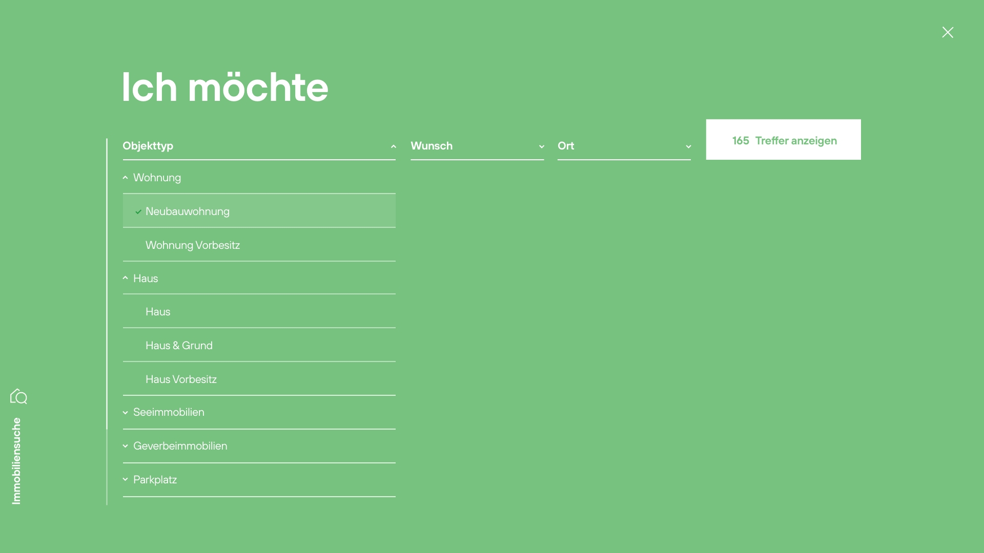
– Reflect innovative, bold positioning
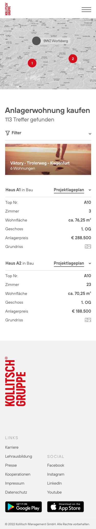
– Visualy separate each division by using color in the side bar navigation
– Create a rich portfolio experience
– Support property exploration with modern search UX
– Make animations elegant and purposeful
– Balance animations with seamless usability
3. Develop
User personas

Names: Lukas & Anna M., 28 & 26
Location: Villach, Austria
Kids: One child, 8 months
Occupation: Lukas is a Software Engineer; Anna is a Primary School Teacher
Looking for: A modern, family-friendly home with long-term value
Behaviors
– Researches properties during evenings and weekends
– Compares neighborhoods based on schools, safety and outdoor space
– Prefers clear navigation and quick access to key information (floor plans, location, pricing)
– Uses both desktop and tablet, often together
Needs
– Trustworthy information about the building process and timelines
– Visuals of family-oriented amenities and interiors
– Easy access to contact or book viewings
– Feeling of security, quality and long-term investment value

Name: Fabian., 30
Location: Graz, Austria
Occupation: Marketing Director at a tech startup
Looking for: A unique, sustainable residential property
Behaviors
– Uses curated websites over listing aggregators
– Mobile-first usage
– Values emotional narrative
Needs
– High-quality visuals
– Clear inquiry path
– Assurance of builder reliability
User Journey Map
We built a journey map focused on Fabian’s experience.

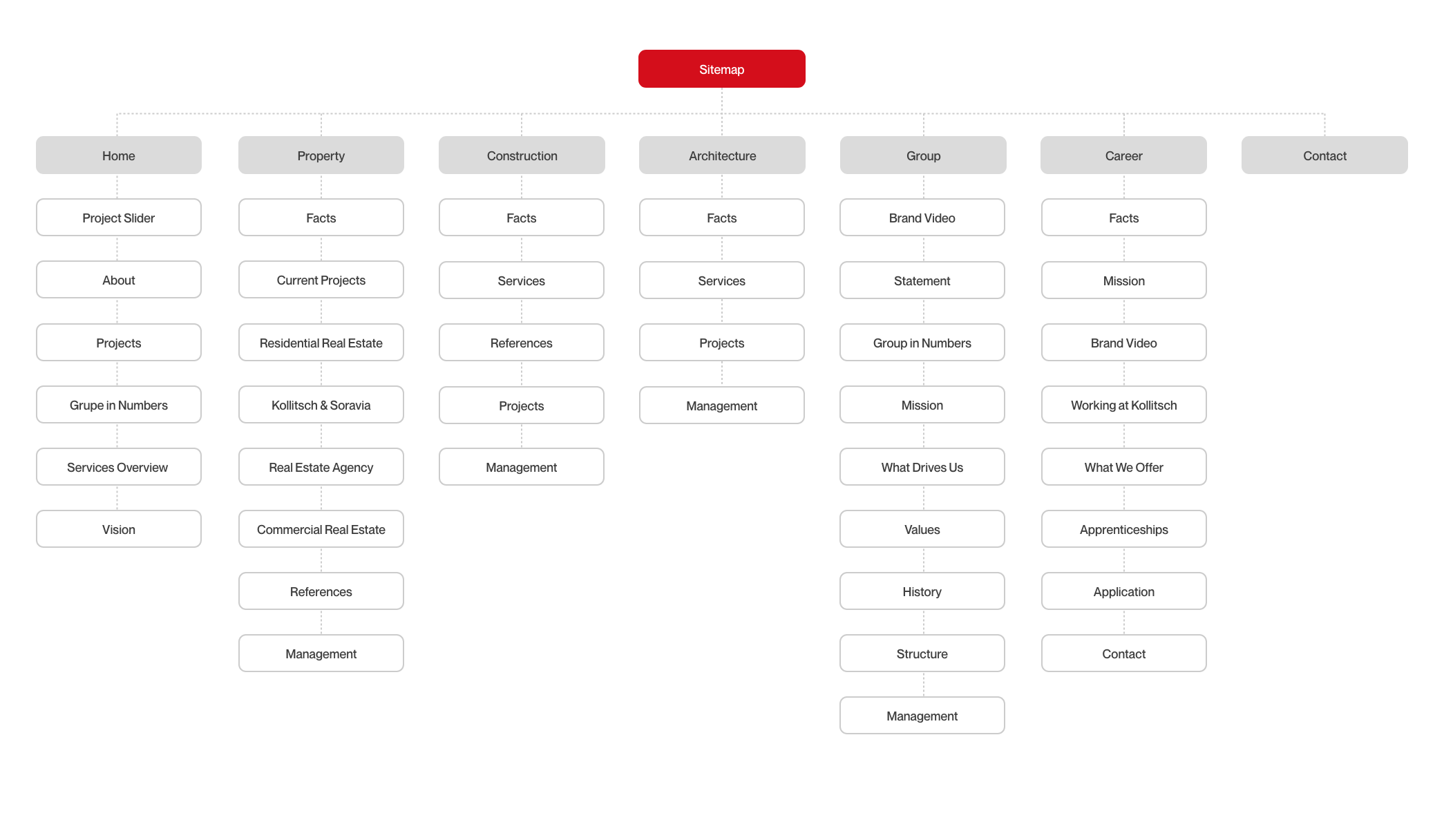
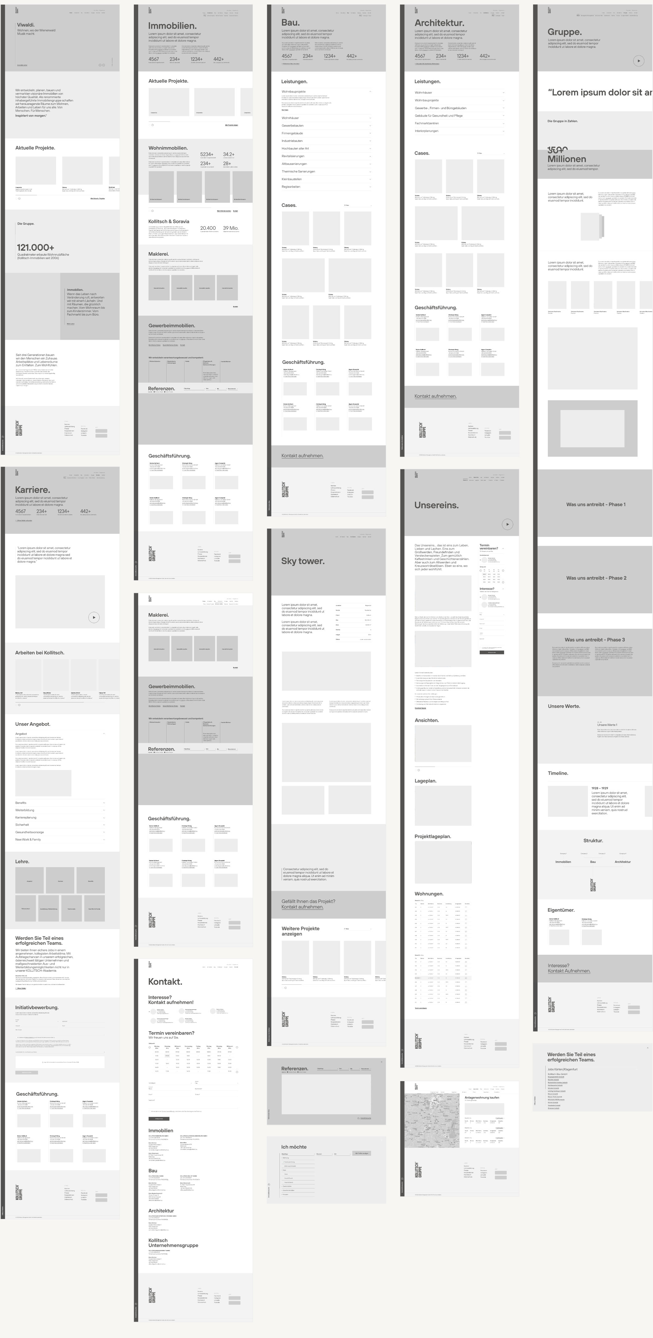
Wireframes
4. Deliver
UI Design
At this stage, a static, high-fidelity design of the website is developed, based on the insights gathered during the previous phases.
All key pages are designed using the final visual language, typography, color palette, iconography and imagery, along with all required interface components.
Early prototype testing showed that users skipped over the collapsible navigation. Based on this feedback, we redesigned the interaction into a persistent sidebar menu, which improved section discoverability and reduced drop-off on subpages.
Handover
Following final client approval, a meeting with the development team was held to explain design behaviors and ensure alignment on functionality. All necessary assets and files were handed over for implementation.
Throughout the entire process, the client was actively involved, giving feedback and approvals at each stage to ensure the final product met expectations.


Outcome
– Brand identity now reflected online
– Visitors spend 30% more time per session
– Increased inquiries
– Stronger storytelling drives property exploration
The Result
A site that reflects Kollitsch’s buildings, confident, clear and quietly magical.
Bonus
After Kollitsch launched new brand identity and the website went another real estate agency from the Klagefurt area, Wohnwelt Immobilien, reach out to us inquiring a rebrand.
Reflection
Creating a brand-led UX grounded in archetypes taught us that usability must feel inevitable. This wasn’t just a digital update, it was a flagship moment for the Kollitsch Gruppe’s identity.
While the project launch was successful in terms of user engagement and business outcomes, not everything went as planned. Due to a tight deadline driven by a scheduled press conference, the development phase was rushed. As a result, the client was unable to dedicate time to thorough QA prior to launch.
This led to a few minor design inconsistencies in the final live version, such as spacing mismatches and styling misalignments, which have remained unresolved to this day. Although these issues don’t affect functionality, they compromise the overall polish we intended.
Next Project
mut.agency
Keep Scrolling