Construction
mut.agency – UX
Scroll Down
Background
mut.agency is a design-driven creative agency based in Innsbruck. To meet changing client demands and increasing market complexity, the agency repositioned itself as a strategy-first branding and consulting partner.
Objective
Reposition the agency to reflect its expanded capabilities, merging brand strategy, business consulting and creative execution for clients across the DACH region.
Research
Activities
– Competitive audit of regional agencies
– Internal brand and service model review
Findings
– Most agencies focused on aesthetics, not business outcomes
– Clients sought integrated strategic and creative offerings
– The visual market landscape was safe and undifferentiated
– There was a gap for agencies offering disruptive strategy and design
2. Define
Problem
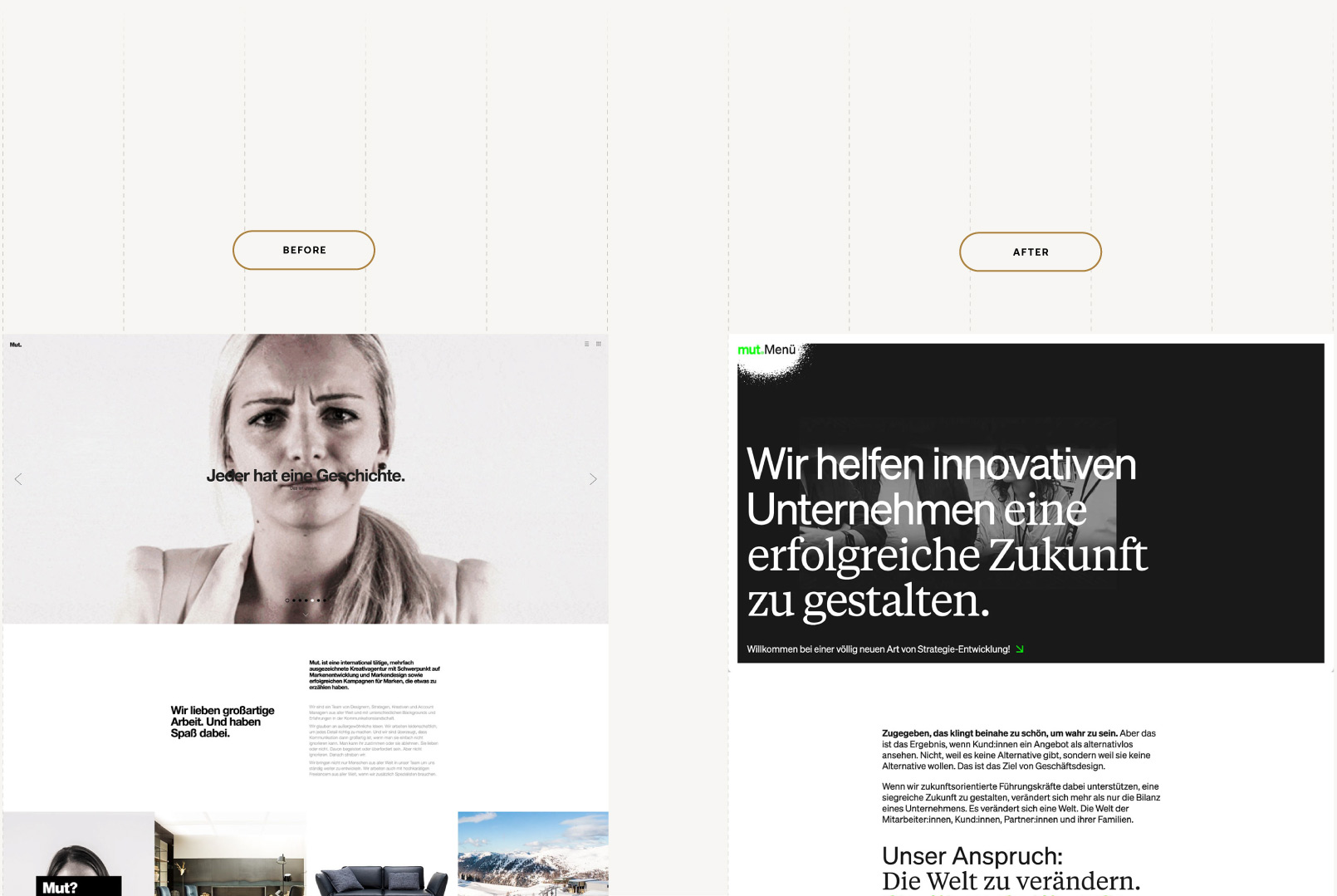
mut.agency’s legacy positioning as a creative studio no longer aligned with its evolving capabilities. Clients viewed the agency primarily as a design vendor, which created a credibility gap for its growing focus on strategy and consulting.
While the team internally embraced a more holistic, business-driven offering, there was a lack of clarity on what made mut.agency different. The challenge was not just visual, it was strategic: how to shift perception, build trust in new services and express a bold yet usable identity that reflected the agency's ambition.
Goals
To address these issues, the rebranding and website redesign were guided by the following strategic objectives:
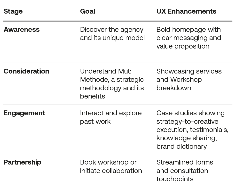
– Reposition mut.agency as a strategy-first branding and consulting partner
– Translate the new service model which focus strategy workshops
– Express the dual archetype identity (Rebel + Sage) through a distinctive design
– Differentiate the agency in the DACH region while maintaining accessibility and clarity
3. Develop

Name: Markus, 42
Occupation: CEO of a mid-sized tech company
Looking for: Partner in developing business strategy
Key Pain Points:
– Lacks a strategic partner for branding
– Wants a clear, actionable brand process
– Needs both innovation and usability
– Frustrated by agencies that only deliver visual assets without strategic depth
Strategic Approach
Shift from design delivery to strategy-led brand development.
Core Elements
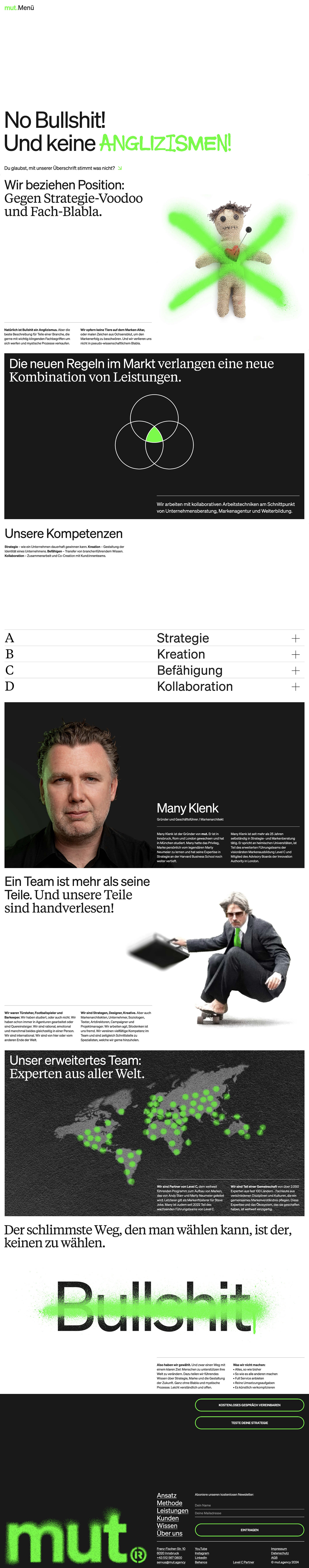
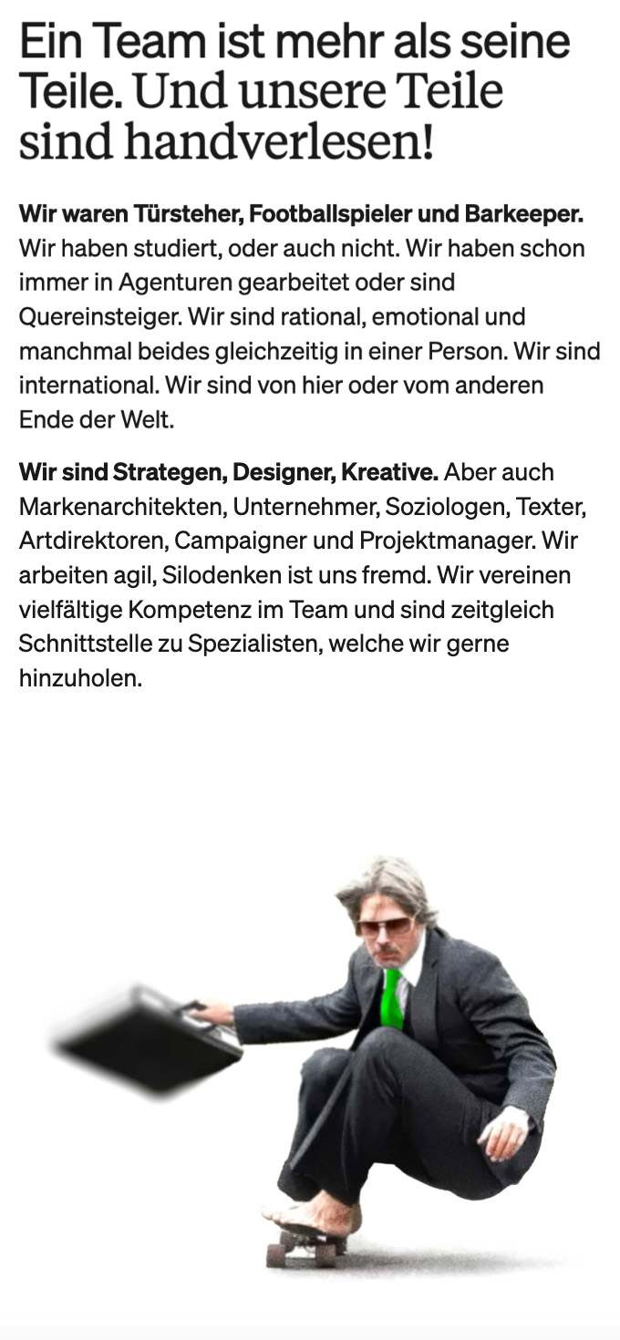
– Dual archetype brand voice: Rebel (disruption) + Sage (depth) which is visually reflected by using spay paint textures and bold typography
– The UI system is built with modularity in mind
– Usability remains central despite the expressive design
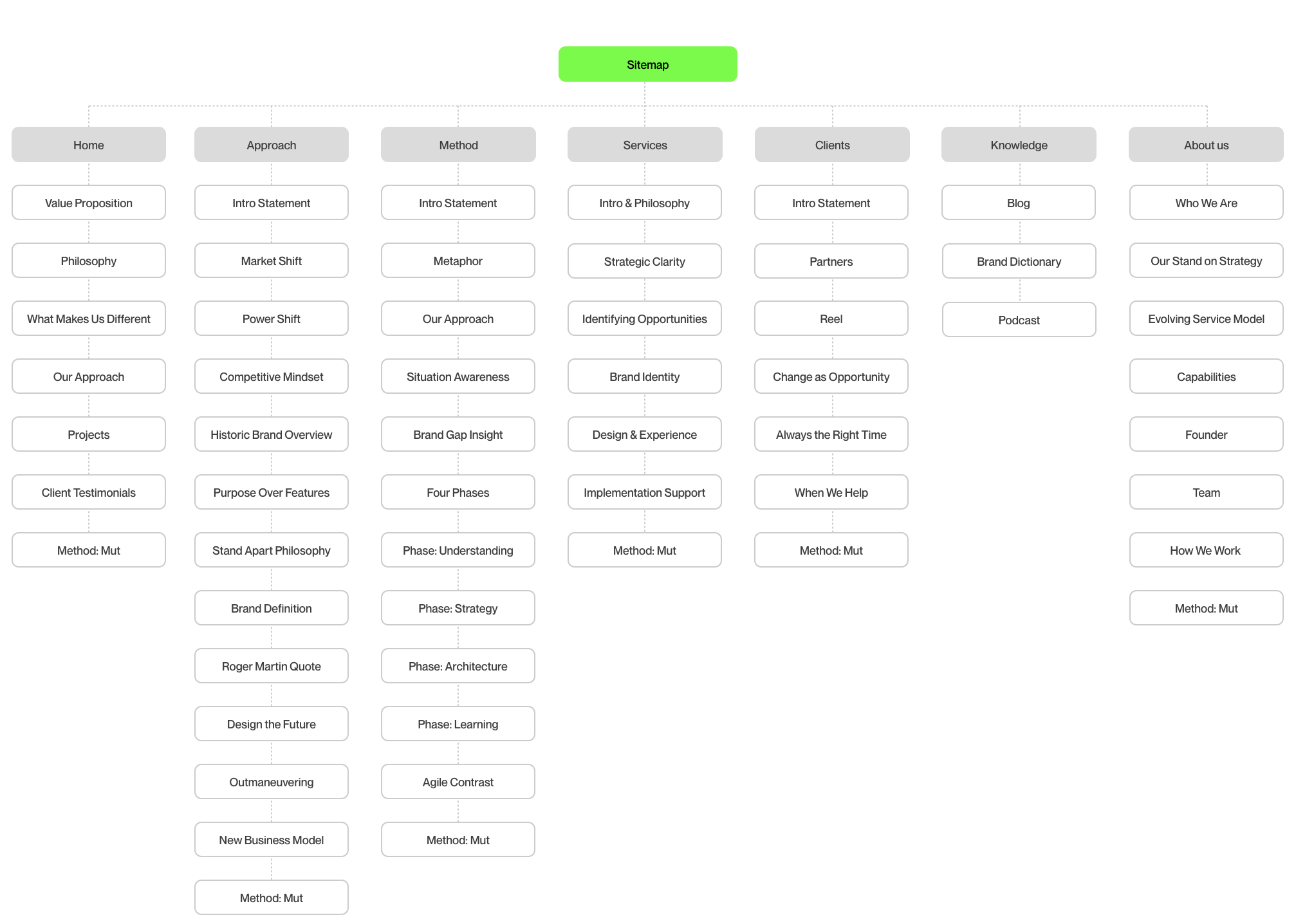
Wireframes
4. Deliver
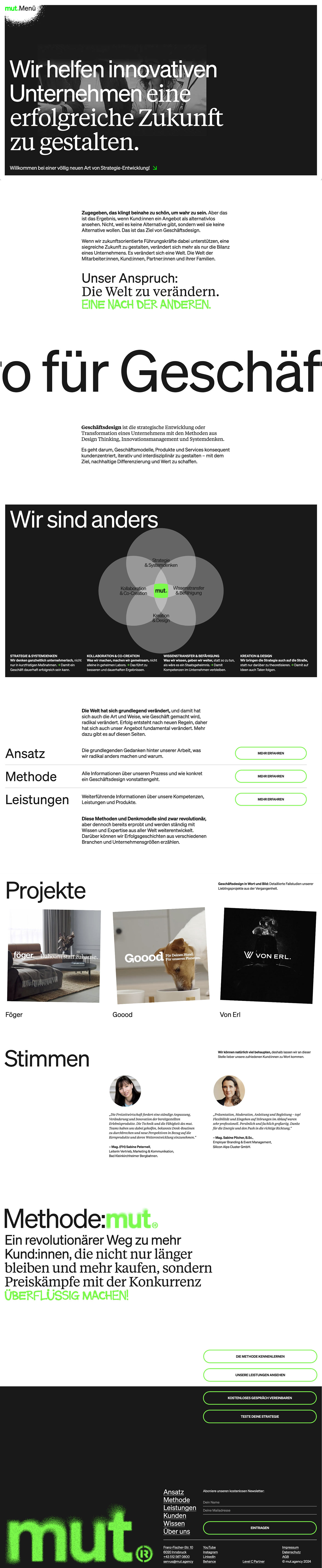
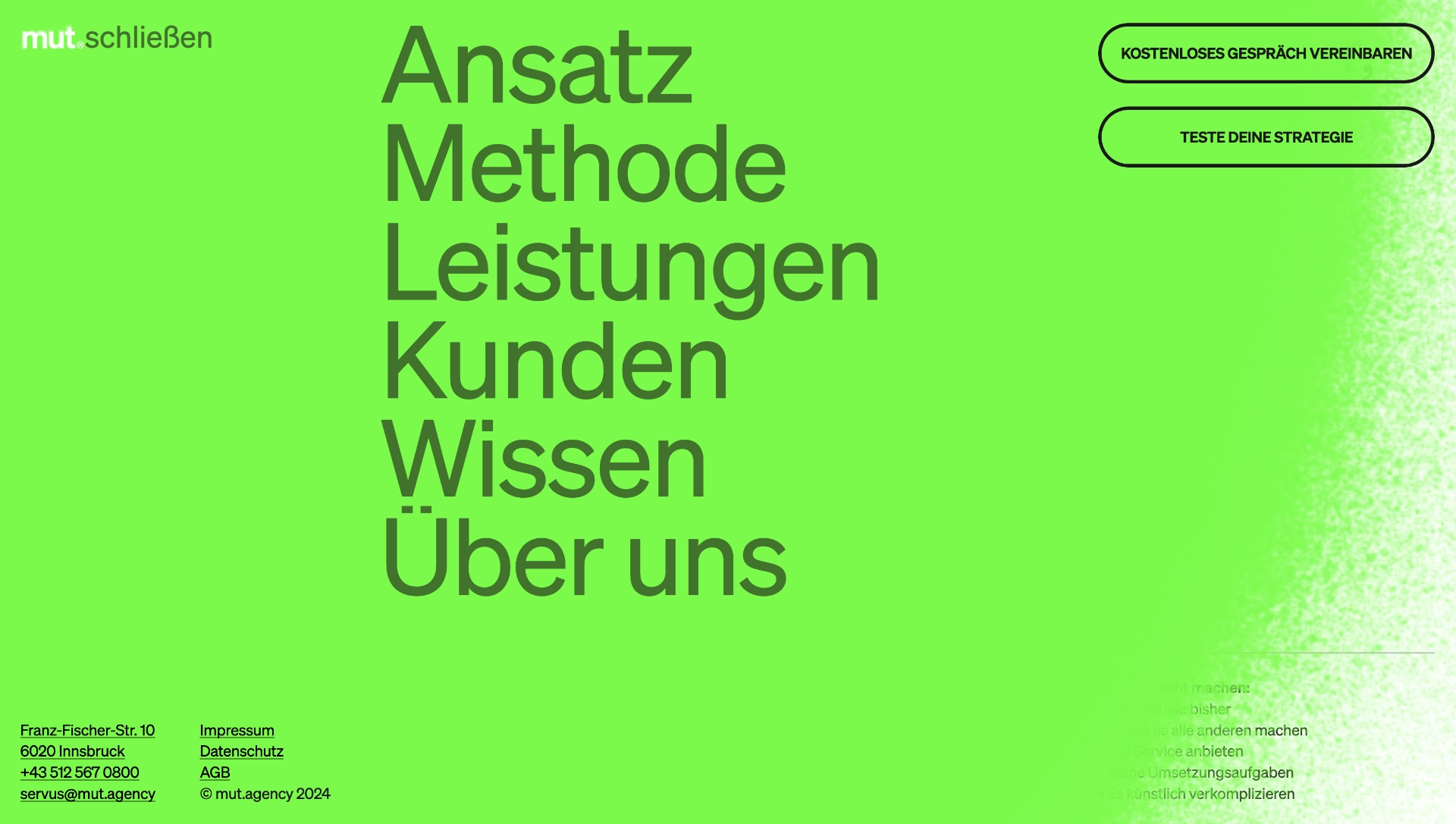
UI Design
Visual Language Development
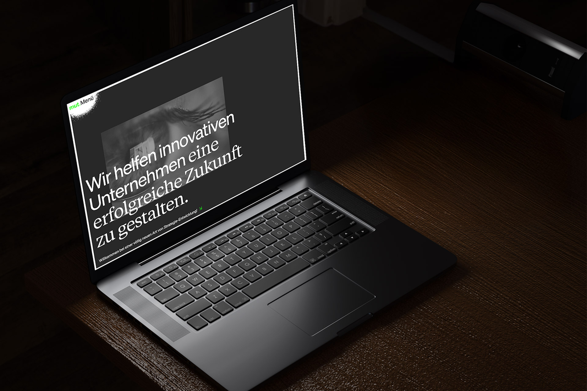
We translated the Rebel + Sage brand archetypes into a bold yet clear visual style. The color palette blends vibrant green accents black and white. Spray paint textures add energy without compromising usability. Bold typography supports readability and brand personality.
Layout and Composition
A modular system allows for quick addition of sections without braking the flow of the pages.
Microinteractions
Custom micro interactions were developed to add personality.
Accessibility Considerations
Colors meet WCAG contrast standards for visibility. UI components support keyboard navigation and screen readers. Scalable typography and adaptable layouts improve readability on all devices.
Outcome
The repositioning and launch produced measurable results:
– Clear differentiation in a crowded agency landscape
– Increased workshop bookings and qualified leads
– Attracted strategy-oriented clients
– Strengthened internal and external understanding of the agency’s mission
– Post launch the website has been optimised based on the user feedback.
Reflection
By embracing a Rebel-Sage positioning and shifting the core offer to strategy-first branding, mut.agency redefined its role.
The visual identity, rooted in urban creativity yet grounded in clarity, now reflects both the agency's ambition and the needs of its clients.
Next Project
Badkleinkirchheim Bergbahnen - Campaign
Keep Scrolling