UX/UI Design
Wohnwelt Immobilien
Scroll Down

Background
Wohnwelt Immobilien is a small real estate and construction company focused on making homeownership more accessible. In contrast to the exclusivity common in the industry, Wohnwelt offers affordable housing with a focus on clarity, warmth and support.
Objective
Redefine the brand to appeal to a wider audience, especially first-time buyers, by creating a human-centered and transparent identity.
Note
Wohnwelt approached us after seeing the Kollitsch rebrand and website, seeking a similarly thoughtful and approachable digital experience.
Research
We assessed Wohnwelt’s existing website alongside competitors. We conducted stakeholder interviews.
Findings
– Industry tone is often cold and bureaucratic
– Visual language lacks warmth and relatability
– Messaging relies heavily on insider terminology
– There is space for a brand that leads with empathy and simplicity
2. Define
Problem
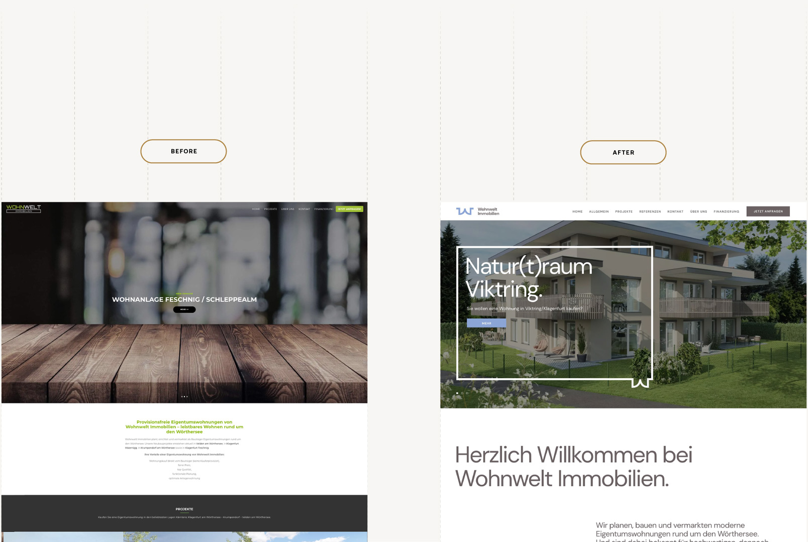
The primary problem Wohnwelt Immobilien faced was that their previous brand and website felt generic, cold and overly bureaucratic, using industry jargon and a templated design that alienated first-time homebuyers like Lisa. This created a barrier of exclusivity and confusion, making it difficult for potential clients to feel welcomed, understood and confident in the home-buying process.
Goals
The brand strategy centered on one idea: “The easiest path to owning a home.”
Key Elements
– Position Wohnwelt as approachable and supportive
– Replace jargon with plain language
– Use visuals and storytelling to build trust
– Develop a brand identity that feels open, warm and grounded
3. Develop
User Personas

Names: Anna & Paul, 29 & 31
Location: Vienna, Austria
Kids: None
Occupation: Anna: Nurse; Paul: Software Developer
Looking for: Affordable, comfortable first home with transparent buying process
Behaviors
– Researches properties mainly in the evenings after work
– Uses mobile for browsing listings, desktop for in-depth reading
– Values clear, straightforward information without jargon
– Prefers brands that feel trustworthy and approachable
Needs
– Simple, jargon-free explanations of buying steps and costs
– Visual tools to compare property features and financing options
– Responsive design for seamless mobile and desktop use
– Personalized support that feels human and empathetic
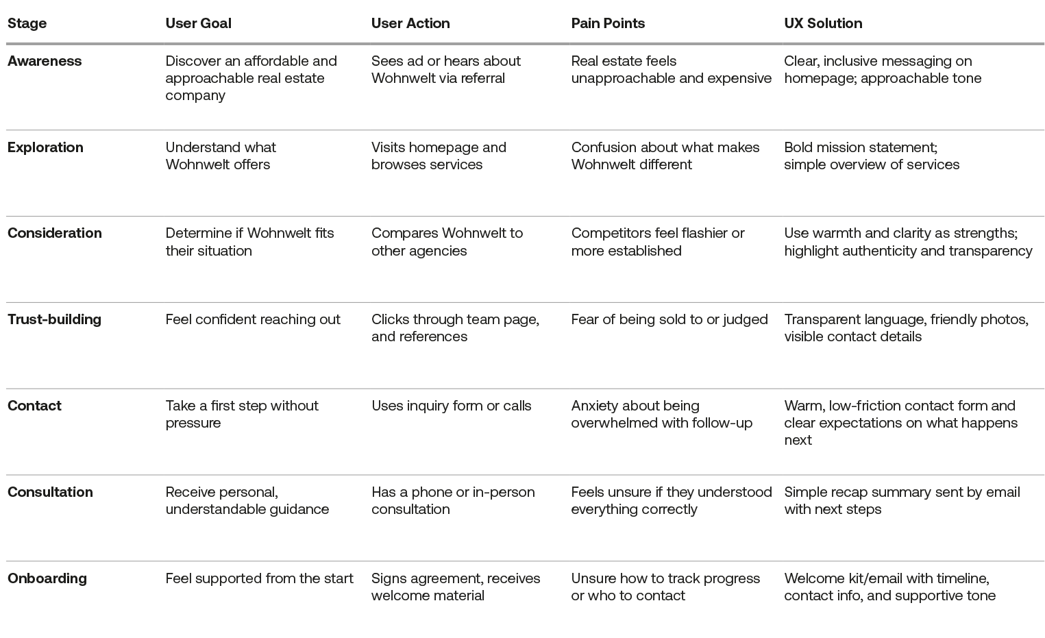
User Journey
The user journey mapping was developed to clearly understand and address the experiences of first-time homebuyers, ensuring each stage, from initial awareness to onboarding, feels approachable, transparent and supportive in line with the brand’s human-centered mission.
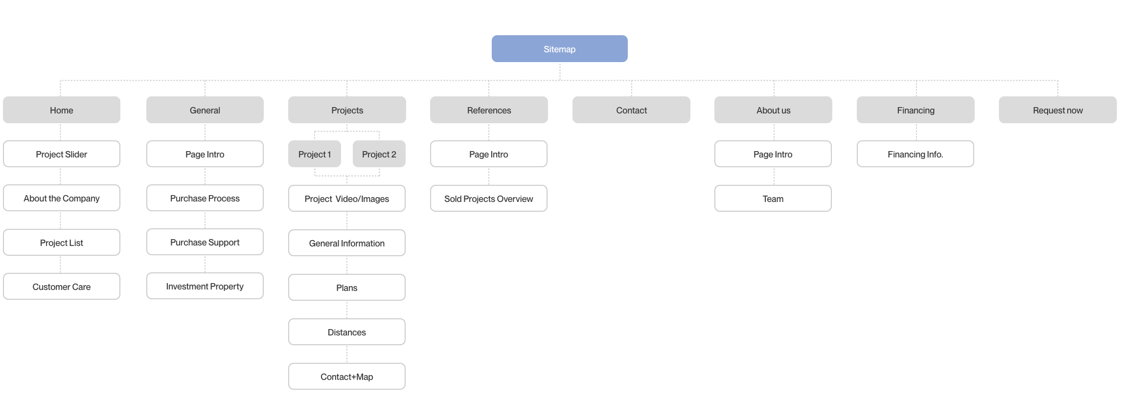
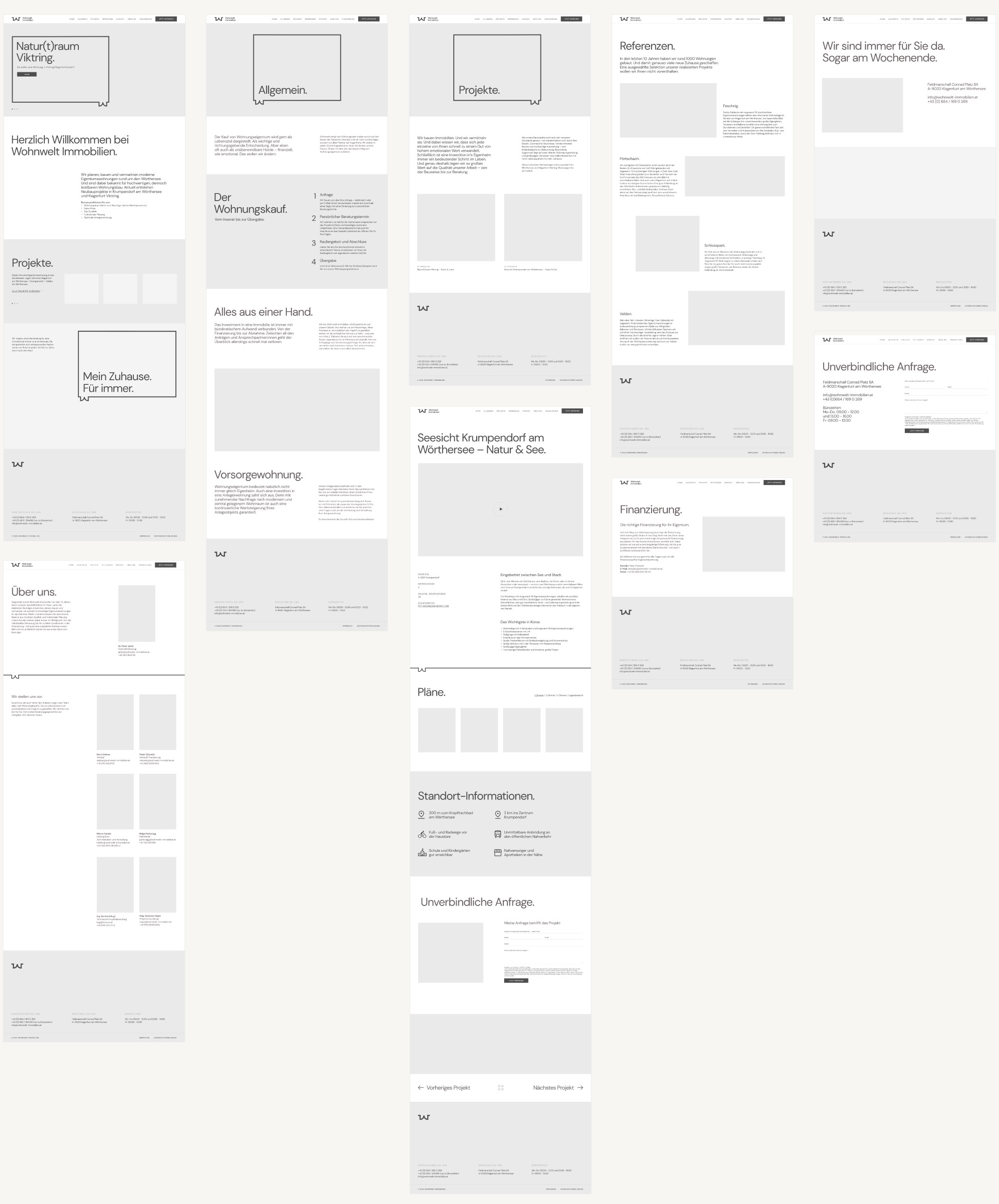
Wireframes
4. Deliver
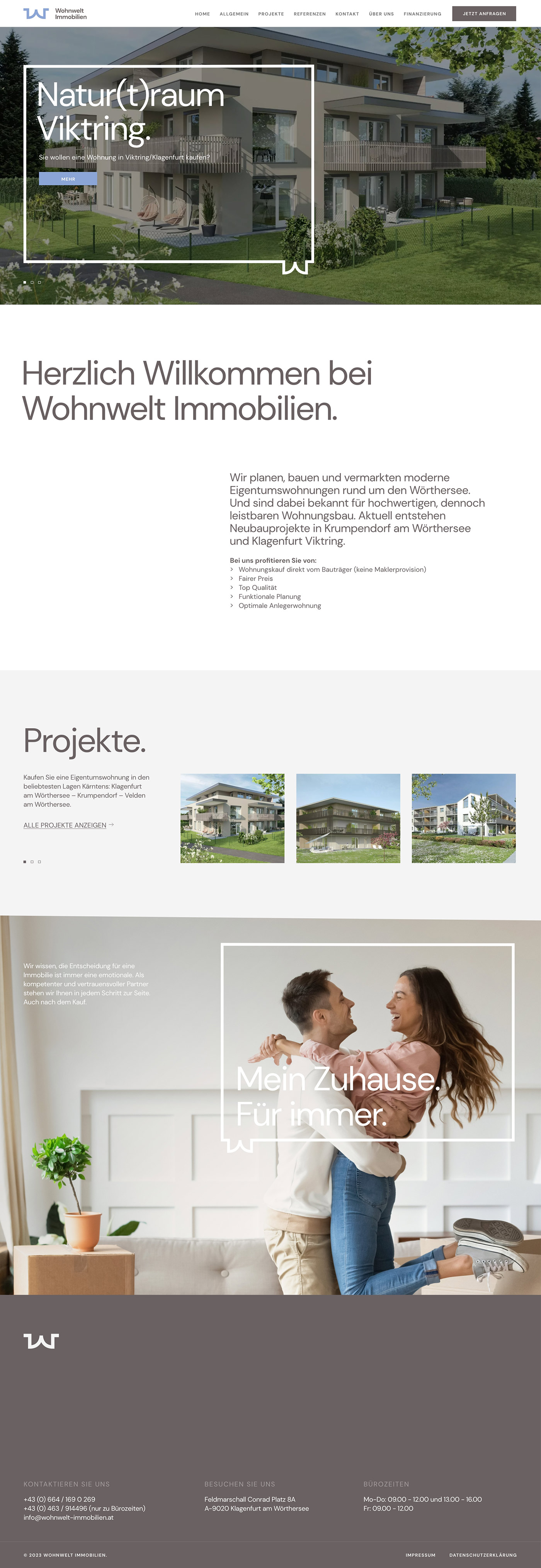
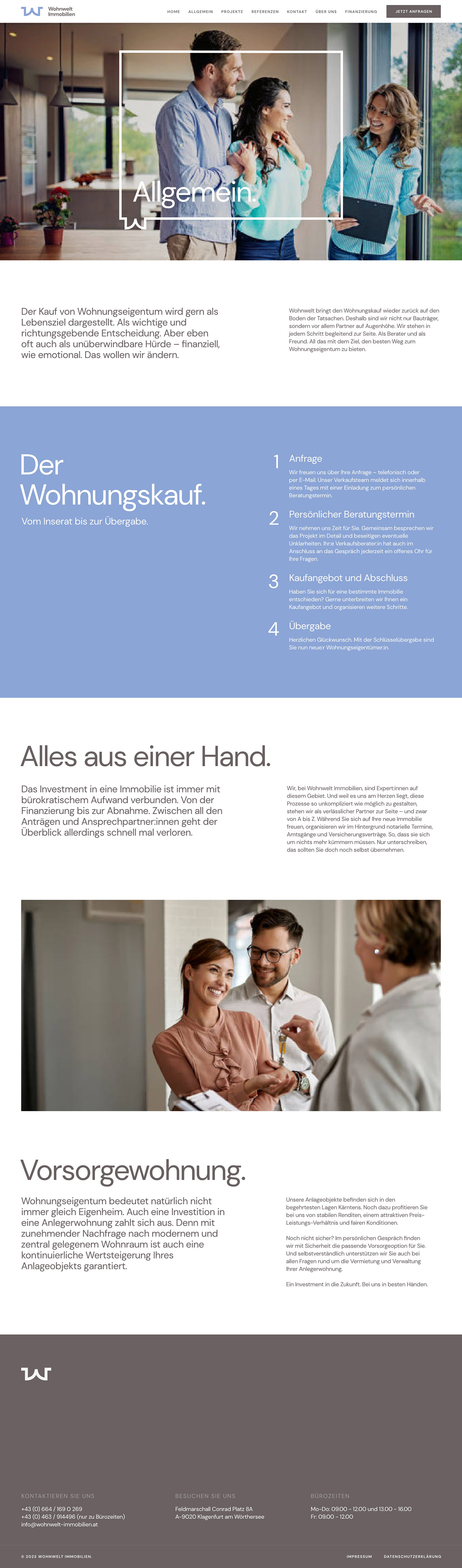
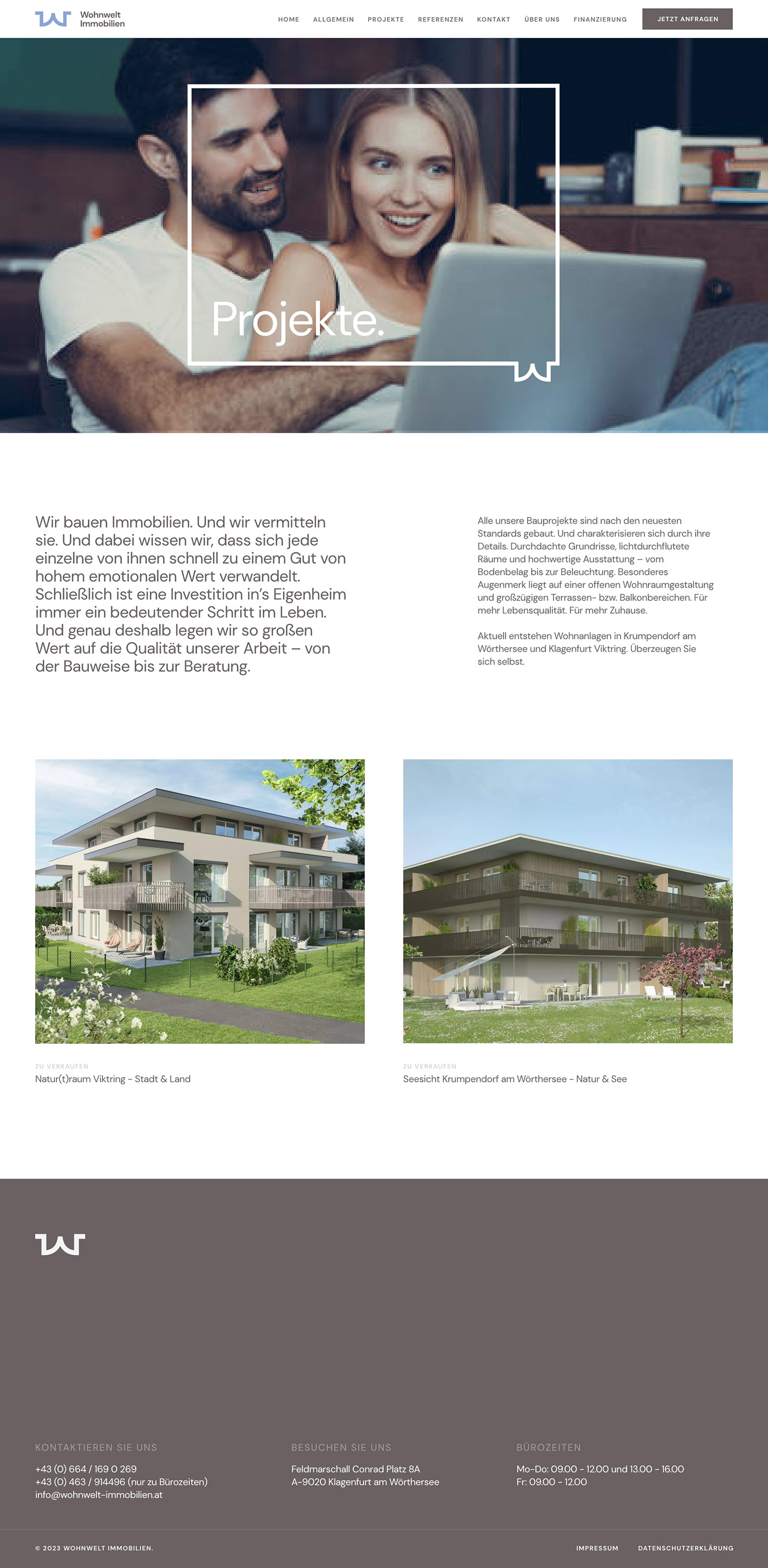
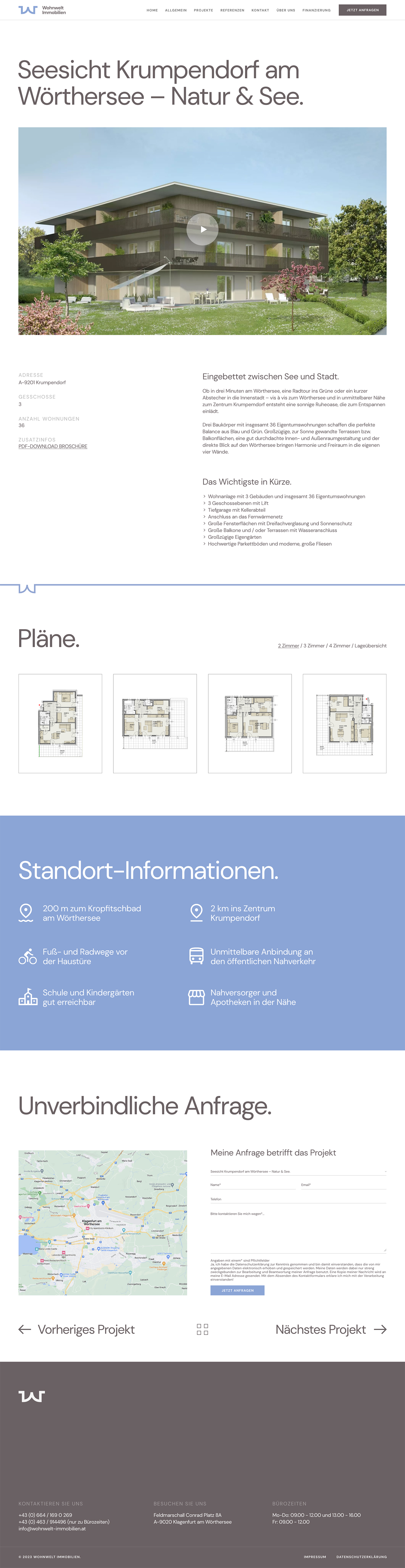
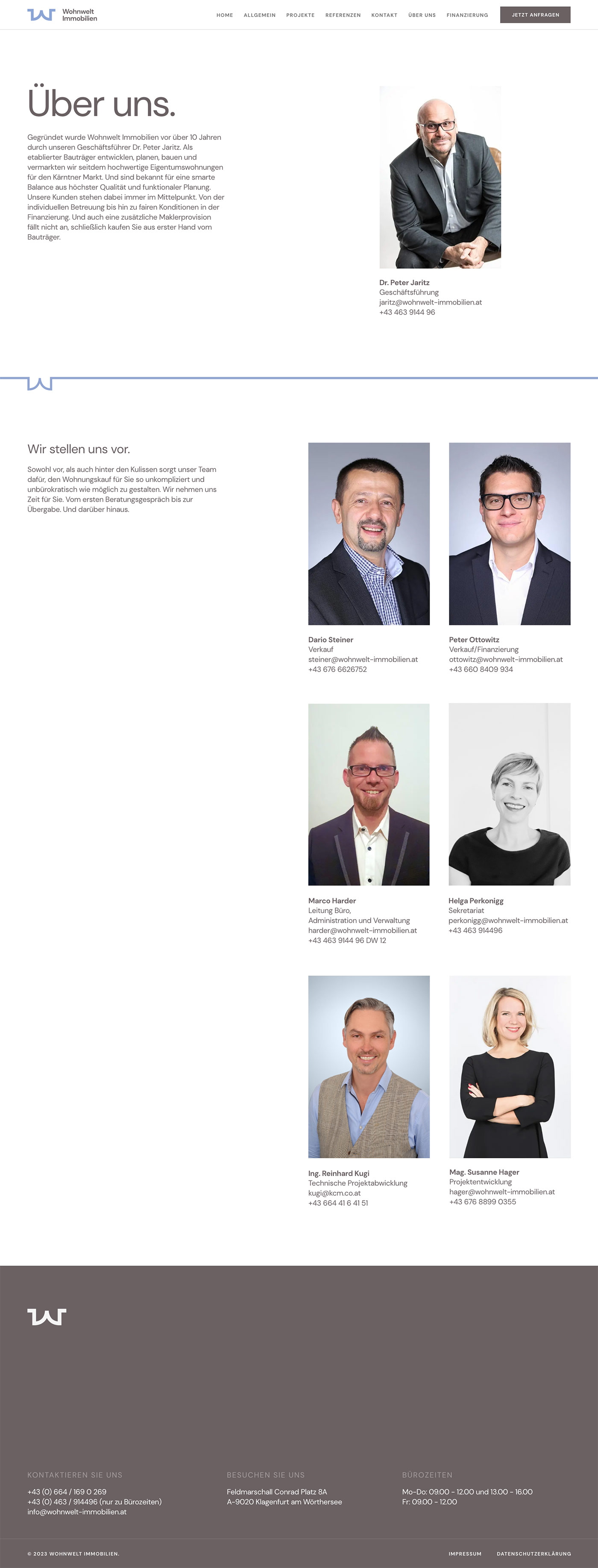
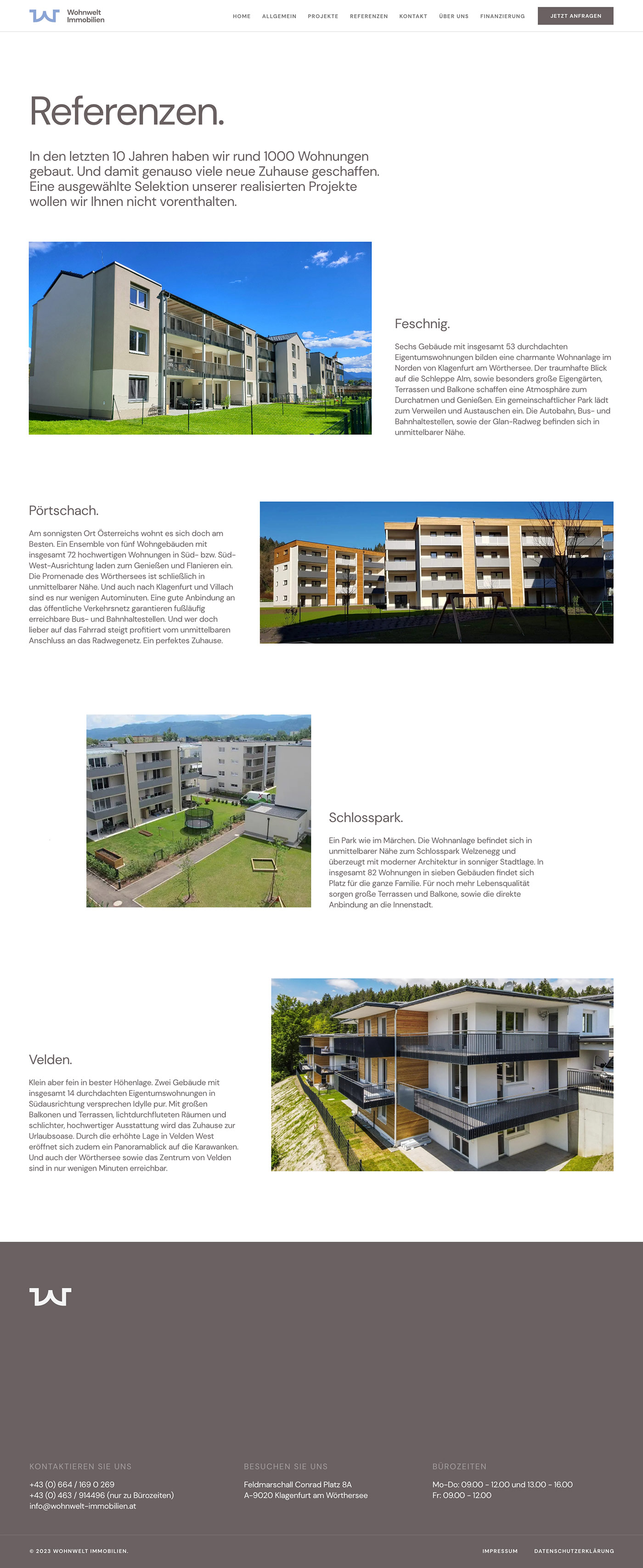
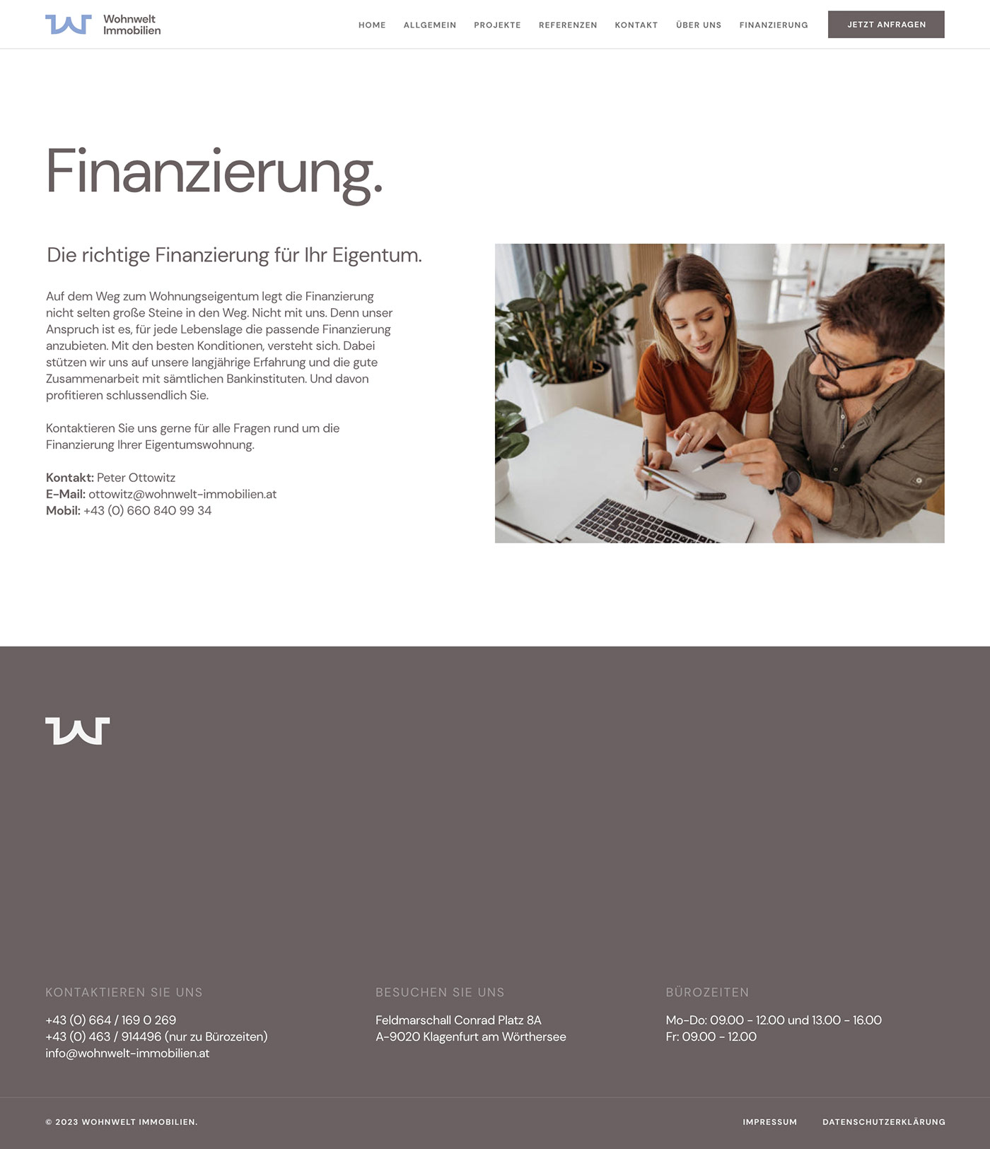
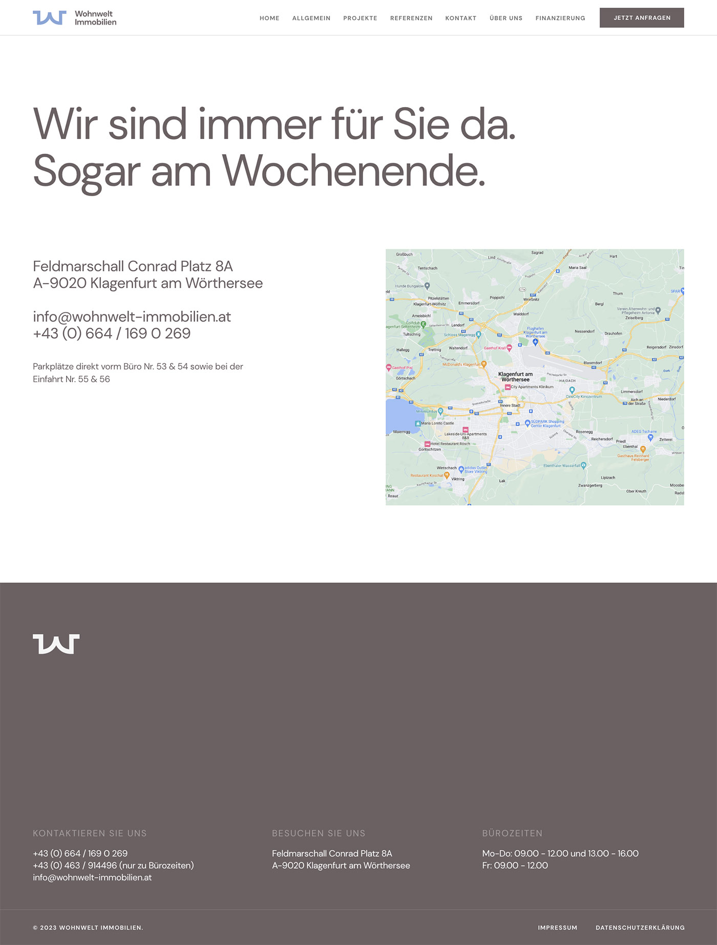
UI Design
The visual identity was designed to reflect clarity, warmth and trust.
Highlights
– Custom animated “W” logo symbolizing open doors
– Warm and muted color palette
– Legible, accessible typography
– Imagery featuring everyday people
– Clean layout prioritizing simplicity and confidence
Outcomes
The rebrand launched with strong results:
– Increased consultation requests and contact form submissions
– Positive client feedback on clarity and tone
– Expanded audience reach through more inclusive messaging
– Wohnwelt reported improved engagement and visibility within their target group
Reflections
This project shows how thoughtful brand strategy can reshape perception in a conservative market. By simplifying language, softening visuals and emphasizing openness, Wohnwelt’s new brand invites more people into the conversation around homeownership.
The animated “W” now serves as a clear, memorable expression of their mission, to open doors.
Next Project
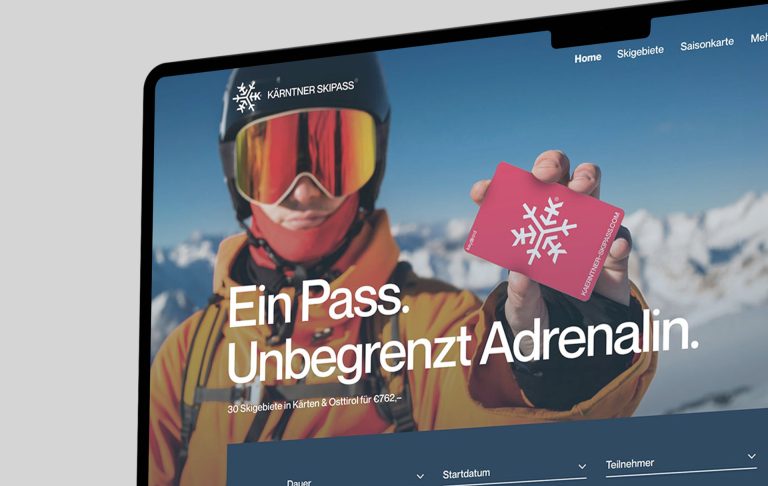
Kärntner Skipass
Keep Scrolling